
Understanding the Basics of Color Theory
The Language of Colors: How Hues Speak to Us
Imagine standing in front of a canvas, paintbrush in hand, with every shade imaginable at your disposal. These colors aren’t just pigments—they’re emotions, ideas, and stories waiting to be told. In the same way, understanding the basics of color theory is like learning a new language. And trust me, once you know how to “speak color,” your web design will never be the same.
At its core, color theory boils down to three key building blocks:
- Primary colors: Red, blue, and yellow—these are your power trio. They can’t be made from other shades but mix them, and they unleash infinite possibilities.
- Secondary colors: Combine two primary colors, and voilà—green, orange, and purple are born.
- Tertiary colors: A splash of primary here, a drop of secondary there—hello, colors like teal and magenta!
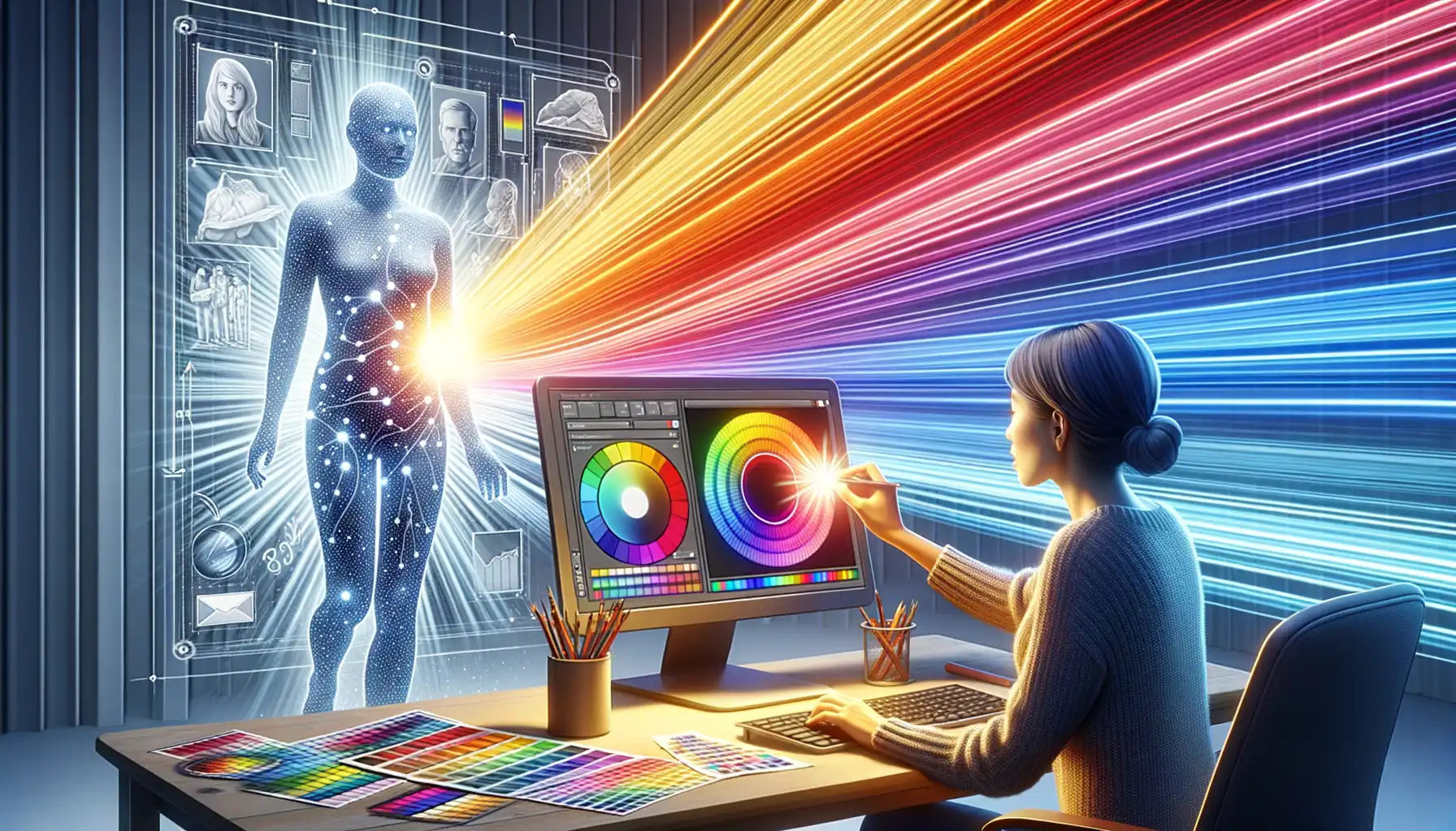
But there’s more than just names and gradients. Ever noticed how red feels fiery and urgent, or blue whispers calmness? That’s because every hue carries emotional weight. On your website, the right palette could mean the difference between “meh” and “wow.”
Color Relationships That Make Magic Happen
Colors don’t exist in isolation—they dance together in harmony (or clash in chaos). To create designs that soothe or excite, understanding their relationships is crucial. Enter the color wheel, your visual guide to these connections. For instance:
– Want contrast? Choose complementary colors, like blue and orange, for bold, eye-catching designs.
– Prefer balance? Analogous colors, like green, teal, and blue, flow seamlessly together.
When you master these interactions, your website design becomes more than functional—it transforms into an experience. And isn’t that what every visitor deserves?
The Importance of Color in Web Design

Why Color Is Your Website’s Secret Weapon
Imagine walking into a bakery filled with pastel pinks and warm yellows. Before you even smell the fresh bread, those colors whisper, “Stay, relax, enjoy something sweet.” That’s the power of color in web design. It’s not decoration; it’s communication. A well-chosen palette doesn’t just look good—it builds trust, sets the mood, and guides user behavior in ways words often can’t.
Think about this: 85% of consumers say color influences their purchase decisions. It’s the first impression, the gut feeling your site gives off before someone reads a single word. Bright reds can inspire urgency (think sale banners), while serene blues slow the pulse, hinting reliability and calm—perfect for financial institutions or wellness brands.
- Red: Power, passion, urgency.
- Blue: Trust, stability, calm.
- Green: Growth, nature, prosperity.
- Yellow: Optimism, energy, warmth.
Don’t underestimate what happens when you mismatch these emotions. Nobody wants a medical website bursting with neon pink—it can feel chaotic or juvenile. But pair soft greens with whites? You instantly evoke cleanliness, healing, and trust. Every shade you pick tells a story, so choose wisely!
How to Choose a Color Palette for Your Website

Discovering the Perfect Color Harmony
Picking the right color palette for your website isn’t just ticking a box—it’s crafting an emotional experience. Think of it as curating the wardrobe your website will wear every day. You wouldn’t show up to a formal dinner in neon sneakers, right? The same goes here: colors need to fit your brand, purpose, and audience like a glove.
Here’s where to start:
- What’s Your Core Message? Are you building trust like a financial advisor (think blues) or sparking creativity like an art studio (hello, oranges and yellows)? Your main message should shape your color direction.
- Who’s Watching? Imagine your target audience standing in front of your site. What’s their vibe? Millennials might lean toward minimalist pastels, while tech-savvy pros may crave bold blacks and silvers.
Test Drive Your Palette in the Wild
Never commit to a color scheme straight out of a design tool. Preview it on real screens! Colors look different on different devices—what pops on your phone might feel muted on a laptop. Also, check contrast ratios. Accessibility isn’t just ethical; it broadens your reach. A visually impaired user should feel as welcomed as anyone else.
Lastly, have fun experimenting! A splash of personality can turn an ordinary website into something unforgettable.
Color Psychology and Its Influence on User Experience
Why Colors Speak Louder Than Words
Ever wondered why you feel calm in a blue room, energized by fiery reds, or soothed by soft greens? That’s the magic of color psychology, and it plays a colossal role in shaping how people interact with your website. Colors don’t just decorate—they communicate emotions, build trust, and guide decision-making without a single word being spoken.
For example, think of a “Buy Now” button. A bold, attention-grabbing orange can create urgency, compelling users to take action, while a soothing pastel might not evoke the same level of enthusiasm. This isn’t just guesswork—there’s science behind every hue!
- Warm tones: Red and yellow stir emotions like passion, energy, or even hunger. (Hello, fast food chains!)
- Cool hues: Blues and greens are calming, inspiring feelings of trust and tranquility—perfect for banks or wellness brands.
- Neutral shades: Grays and whites keep things professional and clean-cut but can feel sterile if overused.
Crafting Experiences Through Colors
The power of color goes beyond aesthetics—it’s about crafting an emotional journey. Imagine landing on a travel blog bursting with tropical oranges and sunny yellows; immediately, you’re daydreaming of beach vacations. Conversely, a poorly chosen palette can alienate users. No one wants to navigate a neon-green finance site—it feels chaotic and untrustworthy.
Remember, colors set the tone for your brand’s story. Choose wisely.
Tips for Effectively Applying Color Theory in Web Design

Bring Your Color Palette Alive
Ever felt that certain websites just “feel right”? Chances are, their designers nailed the art of applying color theory. It’s not just about picking pretty shades; it’s about creating harmony, contrast, and flow that users subconsciously experience. To achieve this, think of your color palette as a living, breathing character.
For example, if you’re designing for a wellness brand, soft greens and gentle blues might soothe visitors. But here’s the kicker—you can’t stop at simply selecting those colors. Use them with intent! Balance your primary and secondary tones so no one color dominates. A splash of complementary orange might add vibrancy without overwhelming.
- Use repetition to build trust: Integrate the same accent color in buttons and headings to guide the user’s eye.
- Keep accessibility in mind: Ensure contrast ratios are readable for all audiences—bright yellow on white? That’s a no-go!
Create Emotional Journeys with Colors
Want to make your website unforgettable? Think about how colors affect emotions. Picture this: a travel site with bold turquoise calls-to-action immediately evokes dreams of ocean escapes. Pairing it with sandy beige backgrounds? Instant beach vibes!
However, don’t overdo it. Too many intense hues can leave users feeling overwhelmed. Instead, think of color application as storytelling—layer shades strategically to create rhythm and guide users toward key actions. Small tweaks like subtle gradients or hovering effects can make your web design more dynamic and engaging.