
What is Mobile Optimization?
Why Your Website Needs to Fit in Everyone’s Pocket
Imagine this: you walk into a store, pick up a product, but the label is impossible to read. Frustrating, right? Now think of your website as that product, and the smartphone user struggling on a tiny screen is your customer. This is where mobile optimization comes to the rescue.
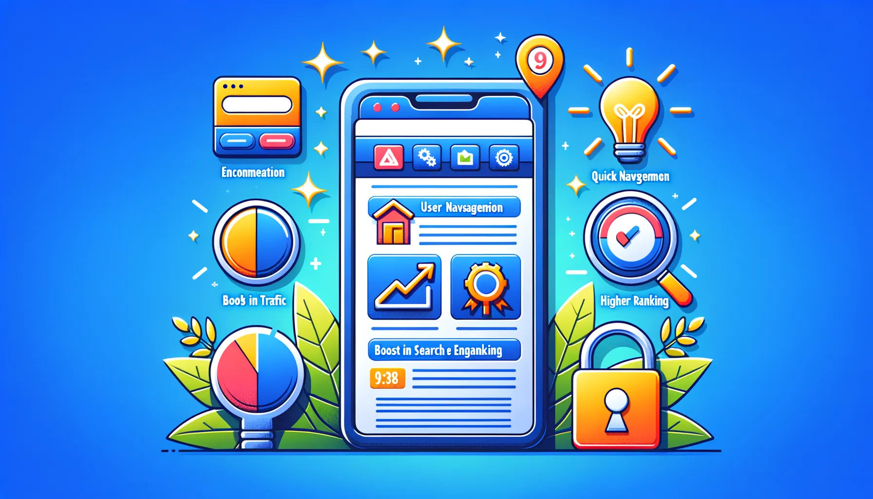
In essence, mobile optimization ensures that your site looks and works beautifully—not just on desktops, but on devices people actually carry around all day: smartphones and tablets. It’s not just about resizing things either. We’re talking about lightning-fast loading speeds, buttons big enough for thumbs (no one likes accidental clicks!), and layouts that feel natural no matter how small the screen.
Here’s what goes into making your website a joy for mobile users:
- Responsive design: Your content adjusts like magic to fit any screen size.
- Touch-friendly navigation: Bye-bye tiny links; hello, smooth scrolling.
- Quick load times: Nobody has patience for slow pages—especially on the go.
Think of mobile optimization as giving your website a wardrobe makeover, so it’s always dressed to impress, no matter where your audience finds it.
Key Benefits of Optimizing Your Website for Mobile
Your Audience Lives on Their Phones
Picture this: your dream customer, coffee in one hand, smartphone in the other, scrolling through search results while waiting for the train. If your website isn’t optimized for mobile, guess what? They might never even see it. Mobile optimization means giving your visitors a seamless experience—no awkward zooming in, no painfully slow load times. And that? That’s the key to keeping them hooked.
Why does this matter so much? Look at the stats: over 60% of online traffic comes from mobile devices. Without a mobile-friendly site, you’re shutting the door on the majority of your potential audience. But with smart optimization, you can:
- Reduce bounce rates: Nobody sticks around on a website that feels clunky.
- Boost conversions: Easy navigation and fast load times mean smoother sales or sign-ups.
- Dominate search rankings: Google loves mobile-responsive designs—and rewards them.
Customer Loyalty Starts Here
Think of your website as a digital handshake. A well-optimized mobile experience says: “Hey, we care about your time and needs.” Users notice these small details. Faster loading pages make impatient shoppers smile. Clear fonts and buttons create trust. By adapting to their screens, you’re not just meeting expectations; you’re exceeding them—and there’s nothing more memorable than that.
Common Challenges in Mobile Optimization

The Sneaky Speed Trap
Imagine you’re driving on a scenic route, loving the view, and then—bam!—you hit an unexpected speed bump. That’s exactly how slow-loading mobile sites feel to your users. One of the biggest challenges in mobile optimization is page load speed. From heavy images to endless scripts, these elements clog your website like rush-hour traffic. Did you know even a 1-second delay in loading could cost you precious visitors? It’s brutal!
And don’t even get me started on bulky media files. They might look stunning on desktop screens but become oversized headaches for mobile users. Compressing them without losing quality can feel like walking a tightrope, but it’s non-negotiable.
Design Gone Rogue
Mobile screens are tiny compared to desktops, so why do some designs act as if they’ve got all the real estate in the world? Whether it’s wonky menus, buttons that are impossible to tap, or layouts where text disappears into oblivion, responsive design mishaps can turn your dream site into a nightmare for mobile users.
Key pain points include:
- Mismatched fonts or text sizes causing readability issues.
- Navigation bars becoming hide-and-seek champions.
- Intrusive pop-ups blocking the entire screen (hello, frustration!).
Solving these challenges means putting yourself in your users’ shoes—often quite literally holding your phone and asking, “Would I stick around on this site?”
Best Practices for Achieving Mobile-Friendly Websites

Designing with Your Users’ Thumbs in Mind
Picture this: someone’s waiting in line for coffee, balancing a bag in one hand, scrolling your website with the other. If your site isn’t mobile-friendly, you’ve just lost them faster than spilled espresso! Creating a site that feels natural on any device isn’t just smart—it’s essential.
The first trick? Prioritize touch-friendly design. Buttons and links should be large enough to tap without precision. Nobody enjoys zooming in like a detective just to click “submit.” Aim for at least 48×48 pixels for tappable areas and leave enough space between elements to avoid accidental clicks.
Optimize for Speed and Smoothness
Ever waited too long for a website to load? Feels like watching paint dry, right? Slow-loading pages can cost you visitors. Tools like Google’s PageSpeed Insights can help you identify what’s slowing things down.
- Compress images: Large files kill load times—shrink them without losing quality.
- Minify CSS and JavaScript: Clean up unnecessary code that drags your speed down.
- Make use of browser caching to reduce repeat load times for returning visitors.
Don’t forget responsive design! Test your site across multiple screen sizes. Whether users are on a tablet or a smartphone, they should experience seamless navigation. Show them you care about their time and thumbs!
Future Trends in Mobile Web Design and Optimization

The Rise of AI and Personalization in Mobile Web Design
Imagine a world where your website practically *reads your mind*. That’s exactly the direction mobile web design is heading, thanks to advancements in AI-driven personalization. Think about it: your favorite online store tailoring its layout, recommendations, and even color schemes to suit your tastes.
This isn’t a gimmick—it’s a revolution in engagement. Powered by tools like machine learning, websites are becoming “smarter,” adapting to the user’s preferences over time. Picture this: you’re visiting an e-commerce site on your phone, and it already knows what you’re likely to buy based on past behavior. Goodbye generic experiences; hello hyper-customization.
But wait, there’s more. AI isn’t just about personalization. It’s also revolutionizing tech behind the scenes, from dynamic content creation to smarter voice search optimization. If your website isn’t yet primed for conversations with Siri or Alexa, now’s the time.
– Predictive search bars that anticipate queries.
– Layouts that shift in real-time based on screen size or interaction history.
This era is about creating *experiences*, not just interfaces.
Progressive Web Apps: The Future Is Fast
Let’s talk speed—because, in the mobile-first world, slow websites are *dead on arrival*. Enter Progressive Web Apps (PWAs), the game-changers blending the reliability of apps with the accessibility of websites.
What makes PWAs special? They offer lightning-fast speeds while working offline, thanks to clever tech like service workers. Ever revisited a site only to find it loads in seconds *without* internet? That’s a PWA flexing its magic. Plus, they don’t demand hefty downloads like traditional apps, which means your users get slick app-like experiences minus the storage guilt.
Other perks include:
- Push notifications to keep users engaged, even when not actively browsing.
- A seamless home-screen integration, so your site feels as “installed” as any app.
PWAs are breaking down barriers between apps and the web, offering businesses the best of both worlds. If you’re not considering one yet, you might just be stuck in the past.