Understanding Visual Hierarchy in Web Design
What Makes Your Eyes Dance Across the Page?
Visual hierarchy is the secret sauce that guides the user’s eyes, almost like a choreographed dance across your website. Without it? Well, imagine walking into a crowded flea market with no signs or structure—total chaos.
When done right, visual hierarchy whispers to your audience: “Hey, look here first. Then there. And finally, check this out.” It’s all about determining the importance of elements and arranging them so they *naturally* grab attention. For example, a bold headline like “50% OFF TODAY ONLY” will always outshine a footnote in light grey text.
Look around. Websites like Apple or Netflix don’t just “look good” by accident. Their design flows effortlessly because the right buttons scream “click me,” and the less urgent ones fade into the background. This is hierarchy at play.
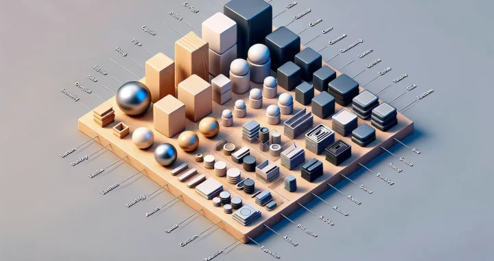
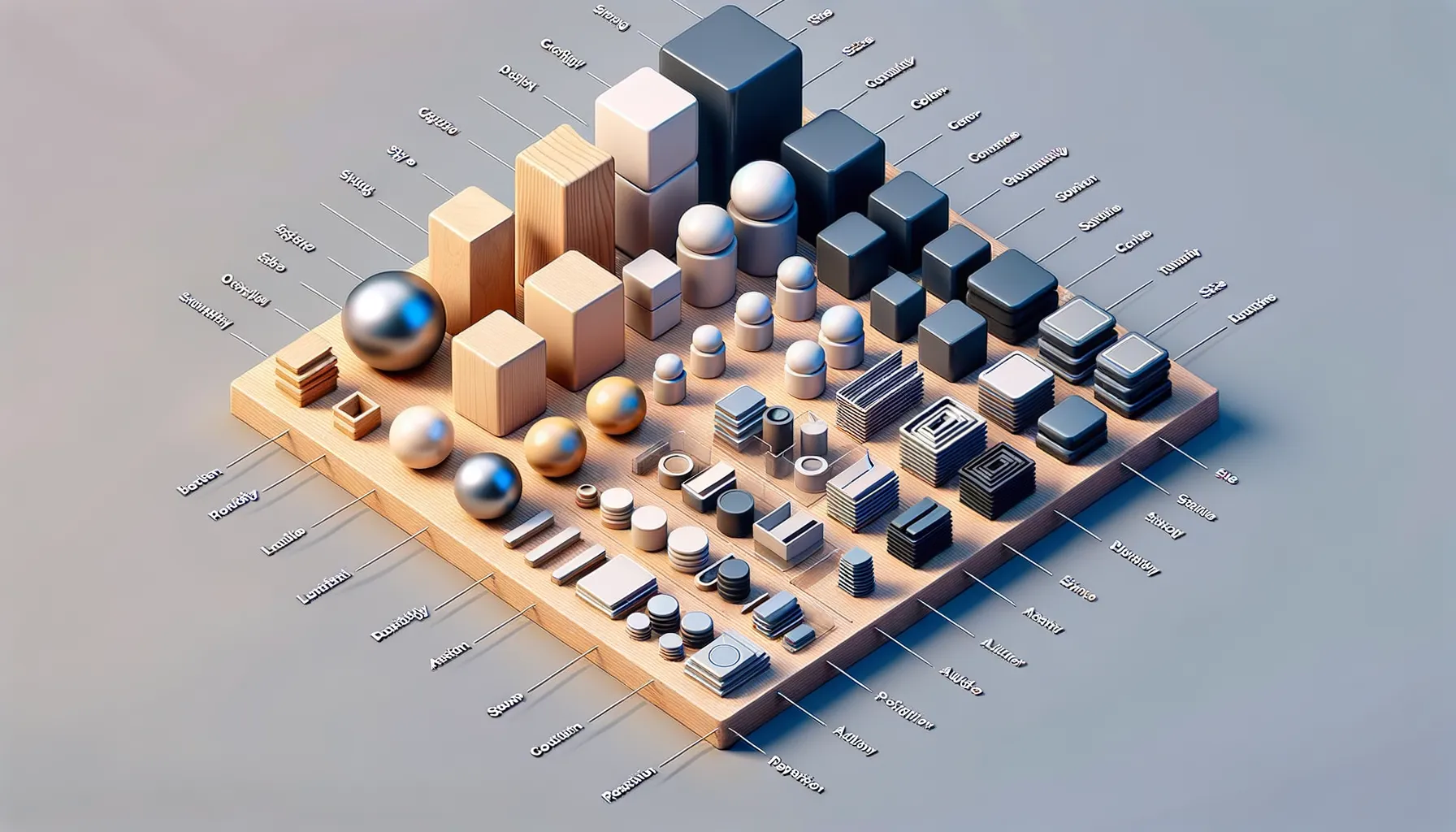
- Size: Bigger often equals more important. Your main call-to-action? Make it unmissable!
- Contrast: Opposites attract. Bright colors on dark backgrounds or sharp edges among soft curves stand out.
- Position: We tend to scan top to bottom, left to right. Smart placement guides the journey.
Visual hierarchy isn’t just decoration—it’s your audience’s GPS. It shows them the straightest path to the destination they (and you) care about most.
Key Principles of Effective Visual Hierarchy
Clarity Through Size and Scale
Ever wondered why headlines jump out at you, drawing your attention instantly? That’s no accident—it’s the magic of leveraging size and scale. Bigger elements carry bigger visual weight. Imagine walking into a room where one painting towers above the rest. Naturally, that’s what your eyes gravitate toward.
For web design, this means using larger fonts or bolder graphics to emphasize critical content like headings, call-to-action buttons, or promotional offers. Not everything deserves the same level of importance, so play favorites! Keep your main headline commanding, while subtext whispers in the background. Remember, it’s not about cramming everything into the spotlight—it’s about guiding your user, step by step.
Order with Strategic Positioning
People are creatures of habit. We instinctively scan content in patterns, most commonly top to bottom or left to right. Take advantage of this! By placing your strongest messages in prime spots—like the top center of your page or along the left margin—you’re leading viewers exactly where you want them.
A quick cheat sheet:
- Headers and logos? Upper left for instant recognition.
- Calls-to-action? Somewhere obvious, like mid-page or right after engaging copy.
- Navigation menus? Keep them predictable but visually distinct.
Positioning isn’t just placement; it’s storytelling. Each section should naturally flow into the next, creating a sense of purpose with every scroll.
Techniques to Implement Visual Hierarchy
Master the Art of Prioritization
Imagine landing on a website where everything screams for attention—headlines, images, buttons, all shouting at the same intensity. Overwhelming, right? That’s where visual hierarchy saves the day! To create a seamless path for your users, start by prioritizing elements. What’s the most important thing on your page? Is it a CTA button? A value-packed tagline? Highlight it with size, contrast, or color. A larger font for your headline or a bold pop of color on your ‘Sign Up’ button can make all the difference.
To make it work like magic:
- Experiment with font sizes: Bigger text captures attention first.
- Use color contrasts: A bright button on a muted background is irresistible.
- Add spacing: White space lets essential elements shine while reducing clutter.
Play with Positioning and Flow
Visual hierarchy is not just about what stands out—it’s about leading the eye in the right direction. Place your core message above the fold, where users naturally look first. Want them to scroll down? Use a zigzag layout or directionally guide them with subtle arrows or flowing lines. Think of it like choreographing a dance: every movement should feel intentional and intuitive.
For added finesse, align elements neatly. Ever noticed how symmetrical designs feel calmer? A tidy grid with properly aligned text and visuals instantly improves comprehension. The better the structure, the easier it is for your users to say: “Ah, I get it!”
The Impact of Visual Hierarchy on User Experience
How Visual Hierarchy Shapes What We See First
Imagine walking into a brilliantly designed store. Your eyes instantly land on a glowing display in the center, while less important items blend into the background. That’s the magic of visual hierarchy, and on a website, it works the same way! It dictates where our eyes go first, what grabs our attention, and—crucially—what actions we’re tempted to take.
When users arrive on your site, their brains are running at lightning speed. Without clear guidance, confusion creeps in. But with smart hierarchy? *It’s love at first sight.* Consider these simple truths about attention:
- Big, bold headlines naturally steal the show.
- Color contrasts whisper (or shout!) cues to click.
- Whitespace calms the chaos and gives breathing room to ideas.
Skimp on structure, and your audience feels like they’re solving a puzzle blindfolded. Nail it, though, and you create an experience that feels instinctive. Suddenly, users don’t have to “figure out” your site—it feels as if it was designed just for them.
Emotion Meets Efficiency
Great visual hierarchy isn’t just about order; it’s about connection and trust. Why? Because when people feel guided—not lost—they stick around. For example, a clean call-to-action button, visually distinct from the rest of the page, says, “Click me! I’m here to help.” It builds confidence.
On the other hand, ever tried navigating a cluttered page where everything screams for attention? Yeah, we’ve all rage-quit those sites. With proper visual cues, you’re not just showing users where to go—you’re making them believe they’ve found exactly what they need. And that belief? It’s pure gold.
Best Practices and Common Mistakes in Visual Hierarchy
Smart Strategies for Nailing Visual Priorities
When it comes to visual hierarchy, think of your website as a stage, and every design element is part of the cast. Who gets the spotlight? Which scene draws the audience in? That’s where smart practices shine:
- First, follow the golden rule of contrast. Want users to click that “Buy Now” button? Make it pop! A bold orange button on a clean white background screams confidence.
- Second, put your key content in the “prime real estate”—the top of the screen or the center. Why make visitors dig for treasure when you can hand it to them on a silver platter?
- Finally, embrace consistency. Fonts, colors, and spacing should feel like they’re all singing the same song, not starting a chaotic symphony.
Pitfalls to Dodge Like a Pro
Even the savviest designers can trip up. One common mistake? Turning the page into a cluttered buffet of information. If everything is important, nothing stands out. It’s like trying to hear one voice in a screaming crowd.
Another stumble is using too many fonts and sizes. It might seem playful, but it ends up looking like an amateur scrapbook. Keep it simple and let just one or two typefaces shine in harmony.
And, beware of neglecting mobile users! A website that looks gorgeous on a desktop but falls apart on a smartphone? That’s a heartbreak waiting to happen. Prioritize responsive layouts so the experience feels seamless everywhere.
Remember, creating a smooth flow isn’t rocket science—it’s storytelling with style.