Why Image Optimization is Critical for Website Speed
Boosting Speed: Why Optimized Images Are a Game-Changer
Ever felt the frustration of waiting for a website to load, staring at a blank screen as images sluggishly appear pixel by pixel? That delay doesn’t just test your patience—it’s a bounce rate ticking time bomb. The culprit? Unoptimized images gobbling up bandwidth like an all-you-can-eat buffet.
Images—no matter how stunning—can act like heavyweights dragging down your page speed. And let’s be real: in the race for online attention, users expect lightning-fast loading times. A slow site can cost you everything from SEO rankings to conversions, leaving visitors clicking away before they’ve even seen what you offer.
- Faster sites rank higher: Google loves speed, and a laggy page won’t get any love from the search engine algorithms.
- User experience thrives: Clean, crisp visuals that load instantly make browsing a joy, not a chore.
- Lower bounce rates: Nobody likes waiting, and optimized images keep users engaged right from the start.
Think about it: optimizing your images is like giving your website a turbo boost. It’s the secret sauce to turning ordinary pages into sleek, high-performing digital experiences!
Best Practices for Optimizing Images

Start with the Right File Format
Choosing the right file format for your images is like picking the perfect tool for a specific job—it makes all the difference. For photos, go with JPEG. It strikes a balance between quality and size without breaking a sweat. Got graphics with sharp edges or transparent backgrounds? That’s where PNG shines. And if you’re adding animations, nothing beats the modern and lightweight power of WebP. Use the wrong format, and you’re burdening your website with unnecessary weight.
Edit Before You Upload
Uploading raw, oversized images is like trying to fit an elephant through a keyhole: it’s just not going to work. Resize your images to match their intended display dimensions. For instance, if your blog’s thumbnail only displays at 300px wide, there’s zero reason to upload a 3000px-wide image—you’re just wasting precious load time.
Here’s a quick checklist for editing before upload:
- Cropping: Focus on the subject, remove distractions.
- Compression: Reduce file size without losing visual appeal.
- Alt Text: Add descriptive text so search engines know what your images are about (bonus: improved accessibility!).
Be picky. Every pixel counts when you want blazing-fast performance!
Tools and Techniques for Image Compression

Say Goodbye to Bulky Images with the Right Tools
Think of image compression tools as your website’s secret weapon—like a magic wand that turns heavy, sluggish visuals into lightweight masterpieces. The best part? You don’t need to be a tech wizard to wield them! Whether you’re taming unwieldy .PNG files or slimming down those chunky .JPGs, there’s a tool ready to jump into action.
Here are a few heroes of the trade:
- TinyPNG: A fan favorite for its simplicity, this online tool squeezes your images down without sacrificing clarity. It’s like sending your pictures to a spa for a sleek makeover.
- ImageOptim: Mac users, rejoice! This app cleans house by stripping out unnecessary metadata while compressing with finesse.
- ShortPixel: Ideal for WordPress enthusiasts, it’s a plugin that works behind the scenes to keep everything featherlight and fast.
Master the Art of Choosing Compression Techniques
Not all compression is created equal—it’s a balancing act between quality and size. Consider using lossless compression when image integrity is non-negotiable (think logos or detailed artwork). Need speed above all else? Go with lossy compression, which slightly trims details but delivers lightning-fast load times.
The trick is testing what works for your specific site. For example, e-commerce pages see better conversions with crisp yet compressed product photos, whereas blogs might prioritize faster loads for lower-resolution images. Always preview your final results—don’t let an over-zealous compressor turn your masterpiece into a pixelated nightmare!
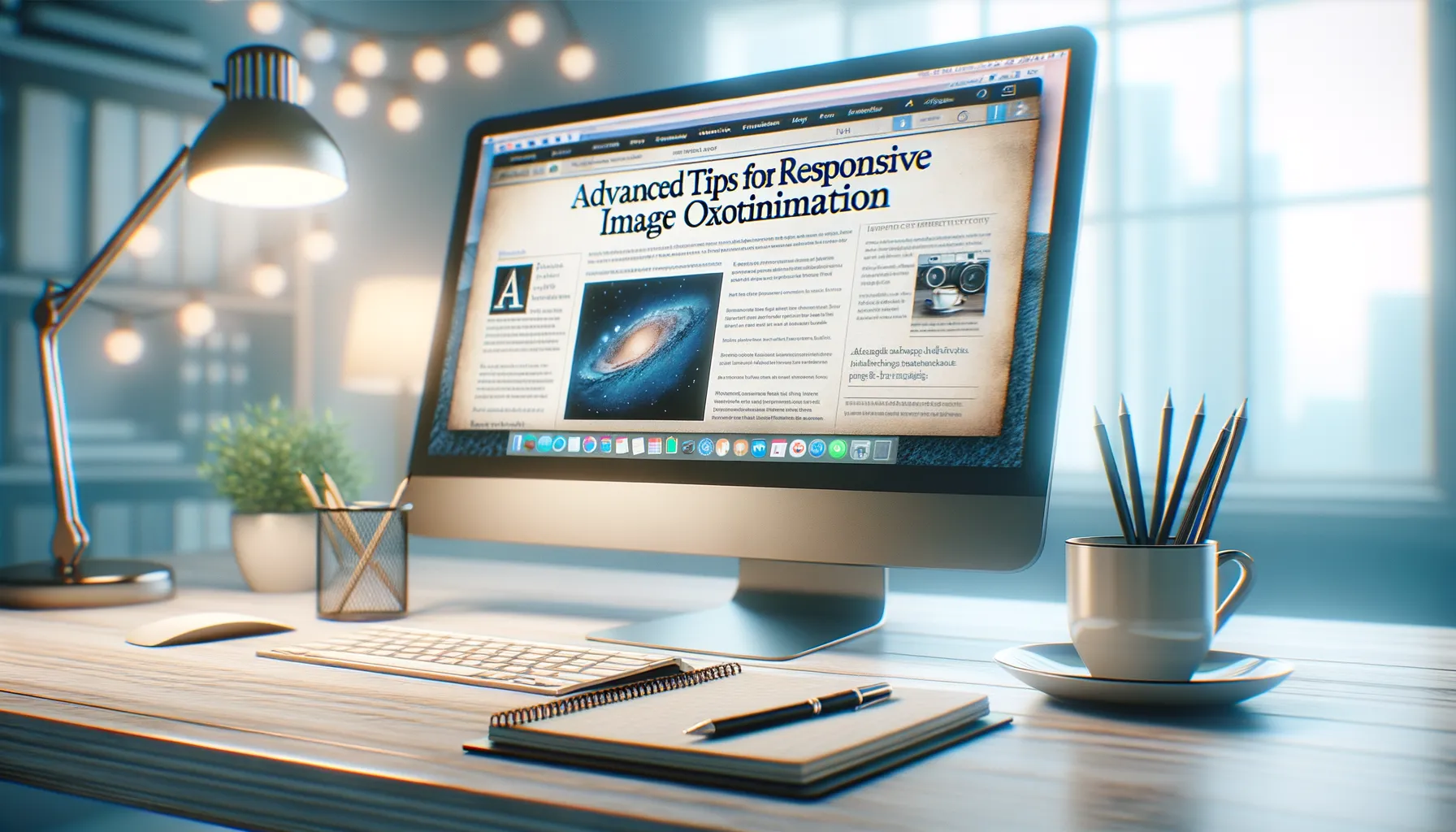
Advanced Tips for Responsive Image Optimization

Bring Precision to Your Media Queries
Responsive image optimization can feel like sculpting—chiseling away at the unnecessary while leaving behind a masterpiece built for every screen size. A one-size-fits-all approach? That’s yesterday’s news. Enter media queries, your toolkit for staying sharp in a multi-device world. Tailor your images not just for desktop or mobile, but for everything in between.
Here’s an idea: experiment with specific breakpoints. Instead of the typical 320px, 768px, and 1024px stops, analyze *your* audience’s devices. Are most visitors on large desktops or budget smartphones? Let their preferences guide you. Fine-tuning media queries isn’t technical geekery—it’s customer care wrapped in code.
The Magic of Art Direction with Picture Elements
Sometimes, a single image won’t cut it. That’s where the <picture> element swoops in like a superhero with a cape full of solutions. Think about this: a sprawling landscape might look majestic in high resolution, but it’s underwhelming when squished into a smaller viewport.
Use the flexibility of the <source> tag inside the <picture> element to serve *different* variations of an image based on device width, resolution, or even format. For example:
- Offer a crisp WebP version to users on supported browsers.
- Fallback gracefully to JPEG for those lagging behind on outdated tech.
This isn’t overkill—it’s attention to detail that enhances both performance and experience.
Monitoring and Testing the Impact of Image Optimization

Understanding How Image Optimization Transforms Your Site
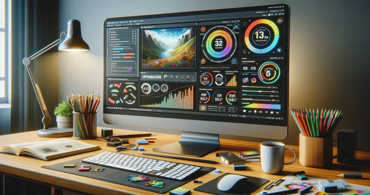
Let’s talk about results—because at the end of the day, you don’t just optimize images for fun. How do you know if all that resizing, compressing, and tweaking is actually paying off? This is where monitoring becomes your secret weapon.
Imagine this: You’ve optimized your website images, and it feels lighter, faster—like switching from a slow jog to a sprint. But without proper testing, it’s like running blindfolded. Use **tools like Google PageSpeed Insights** or **GTmetrix** to track load times before and after making changes. These tools give you measurable proof of how much optimization is boosting your site’s speed.
What To Watch Out For While Testing
It’s not just about speed—image optimization has ripple effects. Keep an eye on these metrics to see the full impact:
- Core Web Vitals: Are your Largest Contentful Paint (LCP) scores dropping? Great news, your site now loads snappier!
- User Engagement: Do visitors stay longer or bounce less? A quicker website often holds attention better.
- SEO Rankings: See if your search engine standing improves—it’s Google’s way of giving you a high five.
Test often, tweak relentlessly, and you’ll see how every kilobyte saved sharpens your website’s performance.

