Understanding the Importance of Color in Web Design
How Colors Speak to Your Audience
Imagine landing on a website that feels like stepping into your favorite cozy coffee shop—warm browns, inviting creams, maybe a hint of soft green. Now contrast that with a site splashed in stark reds and blacks, urgently pulling you in. This is the *power* of color in web design—it doesn’t just decorate; it communicates, emotes, even persuades.
Colors have a language all their own. They trigger emotions, memories, and even instincts. Ever wonder why most “Buy Now” buttons are **bright green** or **bold orange**? It’s because those colors inspire action. Or why healthcare websites lean on calming blues? It builds trust and conveys reliability.
The Psychology Behind Every Shade
When choosing a palette, think beyond aesthetics—think *strategy*. Ask yourself:
- Does this color match the personality of my brand?
- How will these hues resonate with my target audience?
- Do my choices guide users naturally through the site?
Your website’s colors are its first handshake. They whisper—or shout—what your brand is about. Are you approachable? Bold? Luxurious? The right shades turn visitors into believers, so choose wisely.
Factors to Consider When Choosing a Color Palette

Think About Your Website’s Purpose and Audience
Choosing the right color palette isn’t just about what looks pretty—it’s about crafting an experience. Pause for a moment and ask yourself, “What do I want visitors to feel when they land on my website?” Colors have this uncanny ability to set the mood. For instance, a soft pastel scheme whispers “calm” perfectly for a yoga website, while bold reds and yellows shout “energy” for a fitness brand.
Now, let’s talk audience. Your visitors aren’t robots—they’re humans with emotions and cultural contexts. A shade like bright pink might scream fun to one group but come across as overly juvenile to another. Think about their preferences, even their pain points. Are you appealing to trendy Gen Zers, busy parents, or corporate professionals? Each group connects differently to colors.
Balance Functionality with Aesthetics
Your color palette also needs to *work*. Sure, you can fall in love with vibrant orange and neon green—but is that readable? Accessibility matters. Keep these tips in mind:
- Use contrast strategically for text and backgrounds. Black text on a white background? Classic. Orange text on yellow? Ouch!
- Avoid overwhelming users—stick to three or four core colors and use shades sparingly.
Ultimately, your colors should guide users seamlessly, not distract them at every turn.
Steps to Create the Perfect Color Scheme

Start with Your Core Brand Identity
When diving into color design, think of it as creating the wardrobe for your website. What’s its personality? Is it chic and modern like a tailored suit or warm and inviting like a cozy sweater? Start by identifying your core brand identity: What emotions should your site evoke? For instance, a calming wellness brand might lean into soft blues and earthy greens, while a playful e-commerce store could go bold with vibrant pinks and yellows.
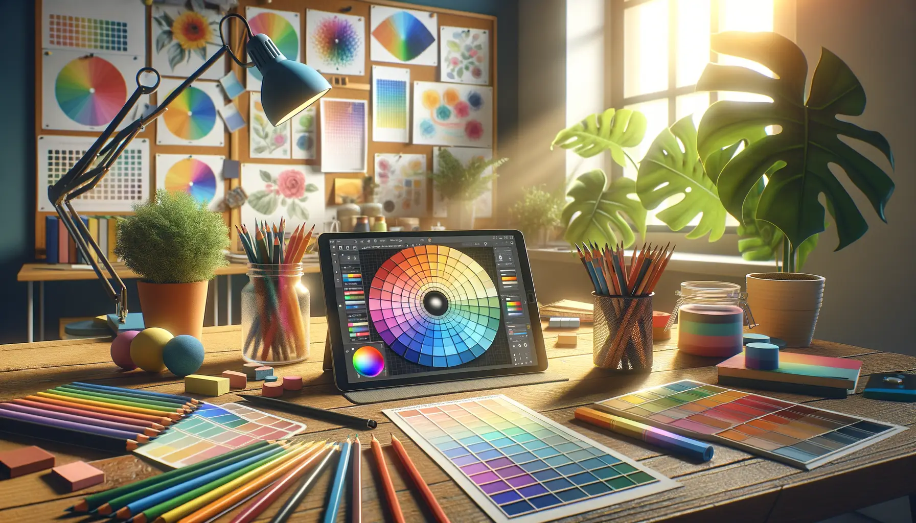
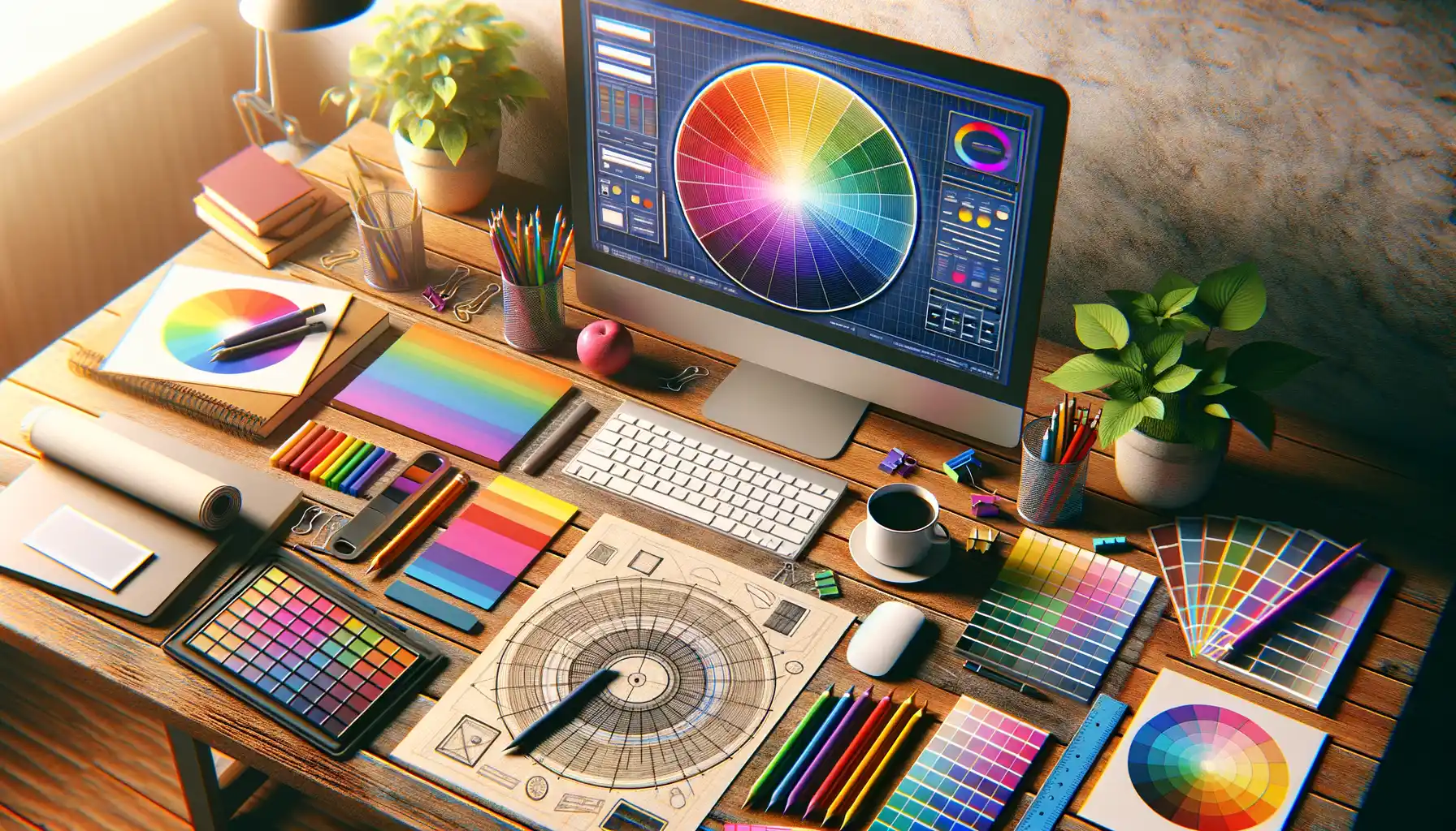
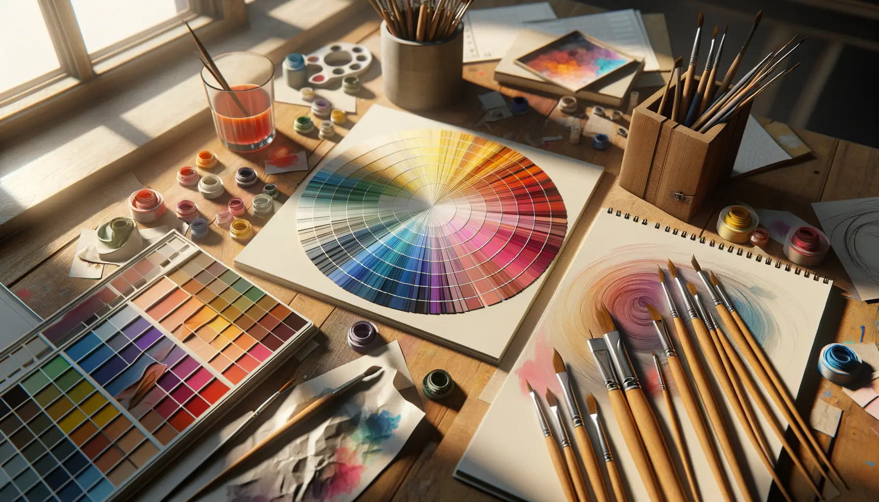
Once you’ve nailed that vibe, pick a primary color—it’s your showstopper, the star of your palette. Then, find complementary hues to play supporting roles. Use a color wheel as your compass here; opposites often attract in dazzling ways.
Build Balance and Contrast
Creating harmony is key, but don’t forget to add a touch of drama! Make sure your combination has enough contrast to make text legible and elements pop. Follow these steps:
- Pair a light background with darker text for readability.
- Use accent colors sparingly—think of them as exclamation points, not full sentences.
- Test shades at varying intensities to ensure balance between elegance and energy.
Think of crafting your color scheme as painting a masterpiece—every stroke should have intention, every shade a purpose. And when you get it right? Pure magic.
Tools and Resources for Selecting Website Colors

Transform Your Color Exploration with These Powerful Tools
When it comes to picking website colors, you don’t need to be an artist with a paintbrush or a wizard with hex codes. There’s a treasure trove of tools out there designed to make your life easier—and dare I say, even fun? Let’s dive into a few favorites that feel like magic wands for color inspiration.
- Adobe Color: Feeling stuck? This tool lets you experiment with harmonious color combinations, from complementary to monochromatic. It’s like having a personal color guru at your side.
- Coolors: Need quick ideas? Tap the spacebar, and boom—a fresh palette appears. It’s like speed dating for colors!
- Canva Color Wheel: User-friendly and sleek, this tool helps you master color theory in minutes. Seriously, it’s foolproof.
Resources to Inspire (and Surprise) You
Sometimes, finding the perfect palette isn’t about choosing colors—it’s about sparking ideas. Dive into *real-world inspiration*:
Dribbble: Browse brilliant designs and see how others wield their palettes like pros.
Design Seeds: Think nature meets creativity; moodboards bursting with vibrant hues await you.
Tips for Testing and Refining Your Color Palette

Experimenting with Your Palette in Real-World Scenarios
Your color palette might look stunning on paper, but how does it hold up when it meets the real world of your website? It’s like choosing an outfit for a party—you won’t know if it truly shines until you step out into the spotlight. Start by testing your colors directly on-page.
Try this: apply your palette to key elements like buttons, headers, and backgrounds. Notice how these colors interact—do they clash or mesh perfectly? View your site on different devices, too. That soft lavender may appear dreamlike on one screen, but dull on another.
Feel like diving deeper? Play with contrast! Test your text-to-background color combos to ensure readability. Tools like Contrast Checker can help identify any sneaky accessibility issues.
Listen to Feedback and Iterate Fearlessly
Sometimes, your audience sees things you don’t. Share your design mockups with friends, colleagues, or even the internet—why not crowdsource some opinions? Pay attention to reactions:
- Which colors inspire the most excitement?
- Are there shades that feel “off” or overwhelming?
It’s all about finding that sweet spot where creativity meets clarity. Don’t be afraid to tweak. Refining your palette is less about perfection and more about creating harmony.

