Introduction to Minimalist Web Design
What Makes Minimalist Web Design So Revolutionary?
Imagine walking into a room with clean white walls, a single piece of art, and just enough furniture to make you feel at ease. That’s minimalist web design in a nutshell—digital spaces void of clutter, where every element serves a purpose.
At its core, minimalist web design isn’t about making things “look simple.” It’s about crafting a focused experience by removing anything that doesn’t belong. Think fewer distractions, faster loading times, and an almost meditative sense of clarity. It’s like giving your users a breath of fresh air in a world full of visual noise.
Apple’s website is one of the best-known examples—it doesn’t bombard you with unnecessary pop-ups or overwhelming visuals. Instead, it elegantly highlights what matters: the products. The same approach applies to minimalist design. But this isn’t about being boring—it’s about intentionality.
If you’ve ever clicked on a cluttered site and felt like running for the back button, you know why less can actually mean more. Stay tuned, because we’re only scratching the surface of this movement that’s changing the way we think about the web.
Key Principles of Minimalist Web Design
Simplicity That Speaks Volumes
Minimalist web design isn’t just about cutting excess; it’s about amplifying what matters. At its core, this style is like a well-orchestrated symphony—every note, every pause, serves a purpose. A minimalist website thrives on clarity, making it easy for users to focus on what they came for. Minimalism thrives on three main pillars: space, focus, and functionality. Let’s unpack them.
- White Space: It’s not “empty” space—it breathes life into a layout. Think of it as the silence between sentences in a heartfelt conversation. It draws attention to the important parts without overwhelming users.
- Focus: A minimalist design ensures your message doesn’t get buried under flashy distractions. Whether it’s a bold call-to-action button or a crisp headline, everything is designed to guide—not confuse—the visitor.
- Functionality: Every element must earn its place. If your contact form has an unnecessary question, or your animation dazzles more than it informs, it’s time to let it go.
The Art of Restraint
Minimalism demands discipline. It whispers, “Less, but better,” and, honestly? It’s liberating. Take color palettes, for instance—why overwhelm with chaos when a thoughtful pairing of two or three hues can evoke emotion and harmony? Or typography: choosing one impactful font instead of a dozen speaks louder than any cluttered mix ever could.
Here’s the truth: visitors don’t arrive at your site for decoration. They come for solutions, whether that’s buying a product or reading an article. Intricate gimmicks might grab fleeting attention, but streamlined designs build trust. A purposeful header image can ignite curiosity; a clean subscription box feels inviting instead of invasive.
Above all, minimalism respects the user’s time. Every scroll, every click, should make sense—because in a noisy digital world, clarity isn’t just refreshing; it’s irresistible.
Advantages of Embracing Minimalism in Web Design
Experience the Power of Less
When was the last time you felt genuinely at peace while browsing a website? That’s the magic of minimalist web design—it’s like walking into a serene, clutter-free room after a long day. By stripping away the unnecessary, you’re left with a design that whispers instead of shouts. For your users, this means an experience where their focus is drawn to what matters most: your message, your product, your value.
Minimalism doesn’t just look pretty—it performs. Faster load times, fewer distractions, and seamless navigation create an online experience that feels effortless. Who wants to wrestle with clunky menus or flashy pop-ups anyway?
- Speed matters: A minimalist site loads in the blink of an eye, keeping impatient users happy.
- Simplicity wins trust: Clear layouts instill confidence and make visitors linger longer.
- Better accessibility: Clean, uncluttered designs create a smoother experience for everyone.
Minimalist websites are like rare gems—they stand out because they dare to be different. They say, “Here’s exactly what you need, and nothing you don’t.” Isn’t that refreshing?
Best Practices for Creating Minimalist Websites
Start with a Clear Purpose
Minimalism isn’t just about removing elements—it’s about ensuring every single thing on your website has a purpose. Think of it like curating art for an exhibition: if that navigation link or image doesn’t add value, it shouldn’t make the cut. Begin by identifying the core goal of your website. Are you selling a product? Showcasing a portfolio? Whatever your mission, let it dictate every design choice.
Pro tip: When you’re tempted to add, ask yourself, “Does this help my audience or my ego?” Strip away distractions and focus on what truly matters.
Craft Visual Harmony
A minimalist website is all about balance—you want a design that feels calming, not empty. How do you get there? Choose one or two primary colors (hint: neutral tones work wonders) and stick with them. Pair that with a clean typography style, something timeless like sans-serif fonts, and voilà, you’ve set the stage for elegance.
Here’s a checklist for visual harmony:
- Use generous white space to give breathing room.
- Limit animations to one or two subtle movements—think loading icons or hover effects.
- Opt for high-resolution images that speak louder than words.
Remember, in minimalism, less isn’t just more—it’s everything.
Conclusion and Future Trends in Minimalist Design
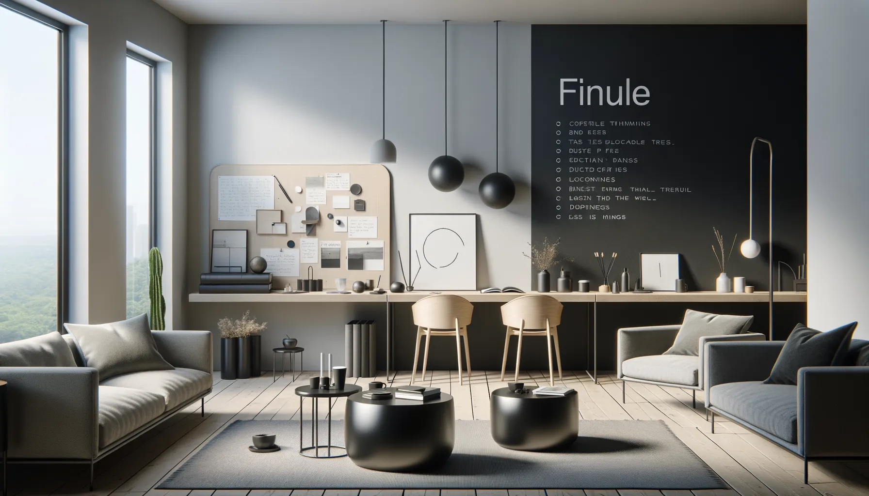
The Evolving Role of Simplicity in Digital Design
Minimalist design isn’t just a fleeting trend—it’s a philosophy that web designers are molding into something truly timeless. Think of it as breathing room for your ideas, where every click and scroll feels purposeful. It’s not about stripping things down to the bare bones; it’s about creating a digital experience that feels as light as fresh morning air, yet layered with depth.
Looking ahead, we’re seeing some fascinating shifts. Designers are merging minimalism with bold experimentation, like using asymmetrical layouts to break the mold or incorporating vibrant, unexpected splashes of color. Imagine a website that feels minimalist—but surprises you with playful typography or subtle animations. Sounds like art, doesn’t it?
- Dark mode designs are also gaining traction, offering minimalist aesthetics paired with energy efficiency.
- Interactive micro-interactions, such as tiny motion cues, are adding personality while staying clutter-free.
Why Storytelling is the New Minimalism
Here’s the thing: users crave connection more than ever. And minimalist design has this almost magical ability to put your story front and center. A beautifully empty white space can amplify your message louder than a screaming headline ever could. Think of the way brands like Apple and Airbnb use simplicity to guide your focus, making every interaction feel intentional.
The future? It’s minimalist interfaces that don’t just “look clean,” but tell stories. Websites will become seamless, almost invisible canvases where the content—not the design—steals the show.

