Why Website Navigation is Crucial for User Experience
The Gateway to Effortless Exploration
Imagine stepping into a beautifully designed store that has everything you need—but there are no signs, no aisles. You’d walk out faster than you walked in, right? That’s exactly how your visitors feel when your website’s navigation lets them down. It’s more than just menus and links; it’s the *compass* guiding users through your digital world. Without it? They’re lost in the wilderness—and not the fun kind with scenic trails.
Great navigation sets the tone for your site’s experience. It whispers, “I know what you’re looking for, and I’ll take you there.” For instance, think of a seamless dropdown menu that instantly connects someone to pricing options or an intuitive search bar that returns spot-on results. These features don’t just serve your audience; they delight them.
- Clarity builds trust: Clean, understandable navigation reassures users they’re in the right place.
- Speed fuels satisfaction: Easy-to-find pages mean fewer clicks, less frustration, and more love for your site.
Website navigation isn’t a background detail; it’s the welcome mat, roadmap, and concierge all rolled into one.
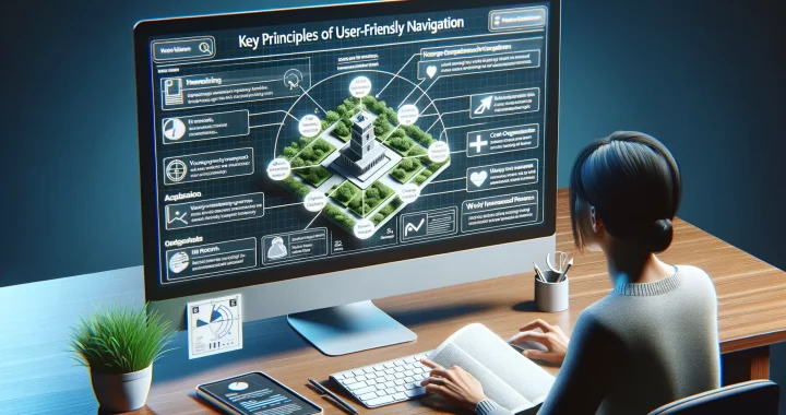
Key Principles of User-Friendly Navigation
Make It Effortless: The Art of Intuitive Navigation
Picture this: You walk into a store where every aisle is labeled, paths are clear, and what you’re looking for is just where you’d expect. That’s exactly how your website should feel—like a breeze to explore.
To craft navigation that feels like second nature, focus on simplicity. A menu overloaded with options is like a cluttered closet; it overwhelms users. Keep it clean and concise. Place your main categories front and center, then nest secondary choices neatly underneath.
Also, think about consistency—it’s your compass here. Use the same menu labels, styles, and logic across every page. Nobody likes to feel lost halfway through their journey!
The Power of Visual Clues and Feedback
Humans are visual creatures. Subtle design elements like highlighting active menu items or using breadcrumbs can work wonders. These act as signposts, reassuring visitors they’re on track.
And don’t underestimate feedback! Links should change color when clicked, menus should expand smoothly, and navigation should feel alive.
Quick checklist for success:
- Use logical hierarchy and group related links together.
- Avoid fancy names—call a spade a spade! Clarity always wins.
Best Practices for Designing Website Navigation
Crafting a Seamlessly Intuitive User Journey
Designing website navigation isn’t just about links—it’s like building a map for an explorer. Imagine someone eagerly landing on your site, ready to dive in. Will they feel like they’re strolling a clear garden path or lost in a maze of dead ends? Here’s how to make the journey smooth and enjoyable.
First, keep it clean and focused! Overloading your navigation with every possible page is like shouting directions all at once. Instead, prioritize key destinations—those essential pages visitors frequently need—and organize them logically.
- Group related content: Use categories and submenus to keep things tidy.
- Stick to familiar terms: Your “About Us” page shouldn’t suddenly be called “Who We Are” unless it’s crystal-clear.
Also, don’t underestimate the power of simplicity. Make sure navigation elements remain consistent across your site—no surprises! For example, your menu shouldn’t shift positions or change fonts when moving from the homepage to a blog post.
Lastly, think mobile-first. Test how your menus work on phones and tablets. A user scrolling with their thumb should find what they need without zooming or squinting. Hint: Keep those dropdowns touch-friendly!
Common Mistakes to Avoid in Navigation Design
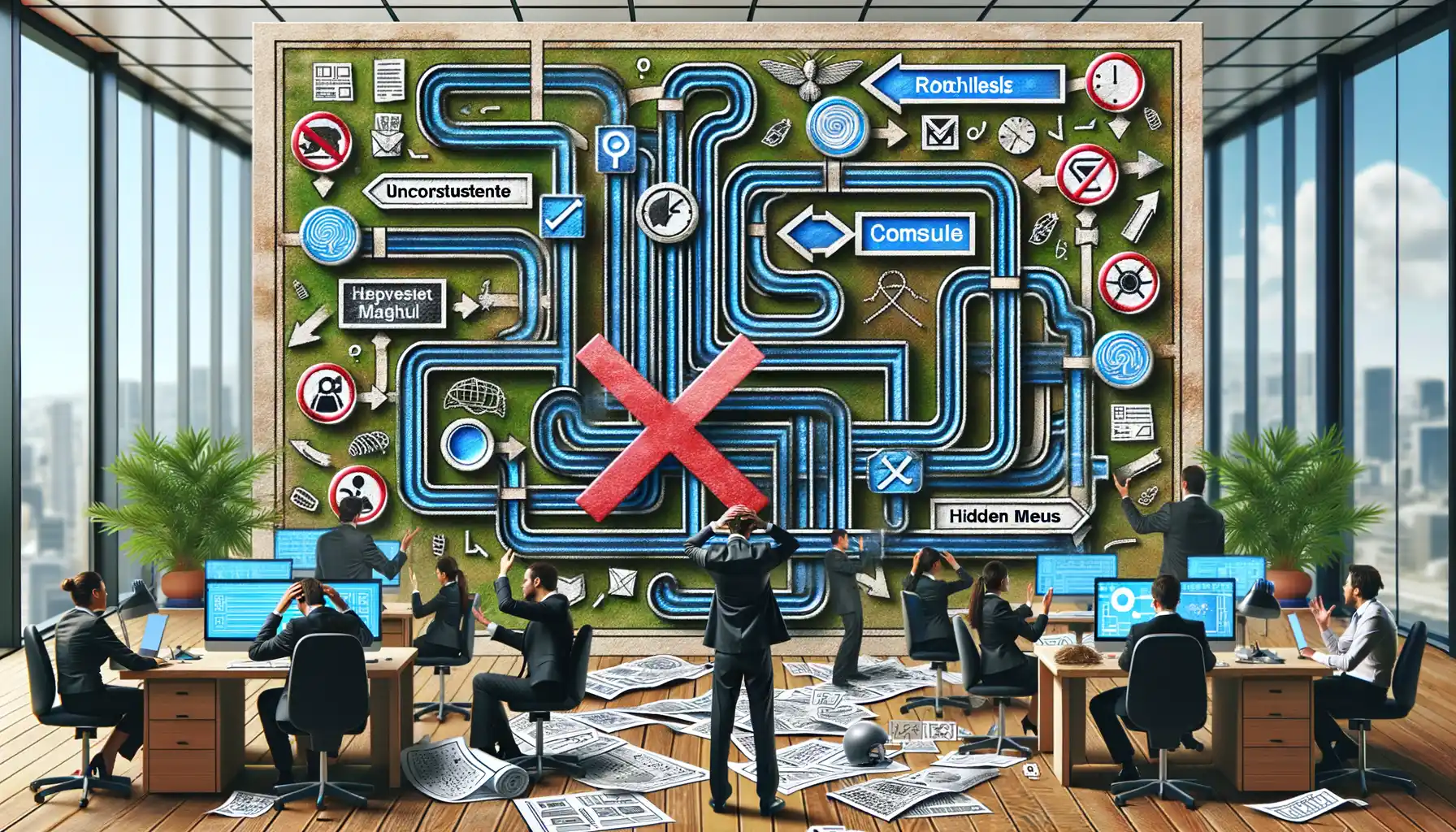
Overcomplicating the Navigation Menu
Ever visited a website and felt like you needed a map, a compass, and a flashlight just to figure out where to go? That’s what happens when navigation menus get overcrowded. Stuffing your menu with too many items is a fast-track to overwhelming your users. Instead, keep your navigation simple: highlight the essentials, not everything under the sun.
Remember, users should grasp your menu’s purpose in seconds. Think of it like meeting someone new—you don’t dump your entire life story on them right away, do you? Stick to the core pages and prioritize clarity.
Using Confusing Labels and Jargon
Oh, how we love to make things overly clever sometimes! But when you use obscure terms or industry jargon for navigation labels, you risk alienating your audience. If they have to sit there scratching their heads trying to decode “Synergy Hub” when all they want is “Contact Us,” you’ve lost them.
Here’s a quick fix:
- Use intuitive language—terms that your grandma, your neighbor, or even a 10-year-old could understand.
- Avoid trendy buzzwords unless they’re truly self-explanatory.
Test your labels with fresh eyes—ask someone outside your field if they “get it.” If they hesitate, revisit your wording. Keep it human!
Tools and Resources to Help Improve Website Navigation
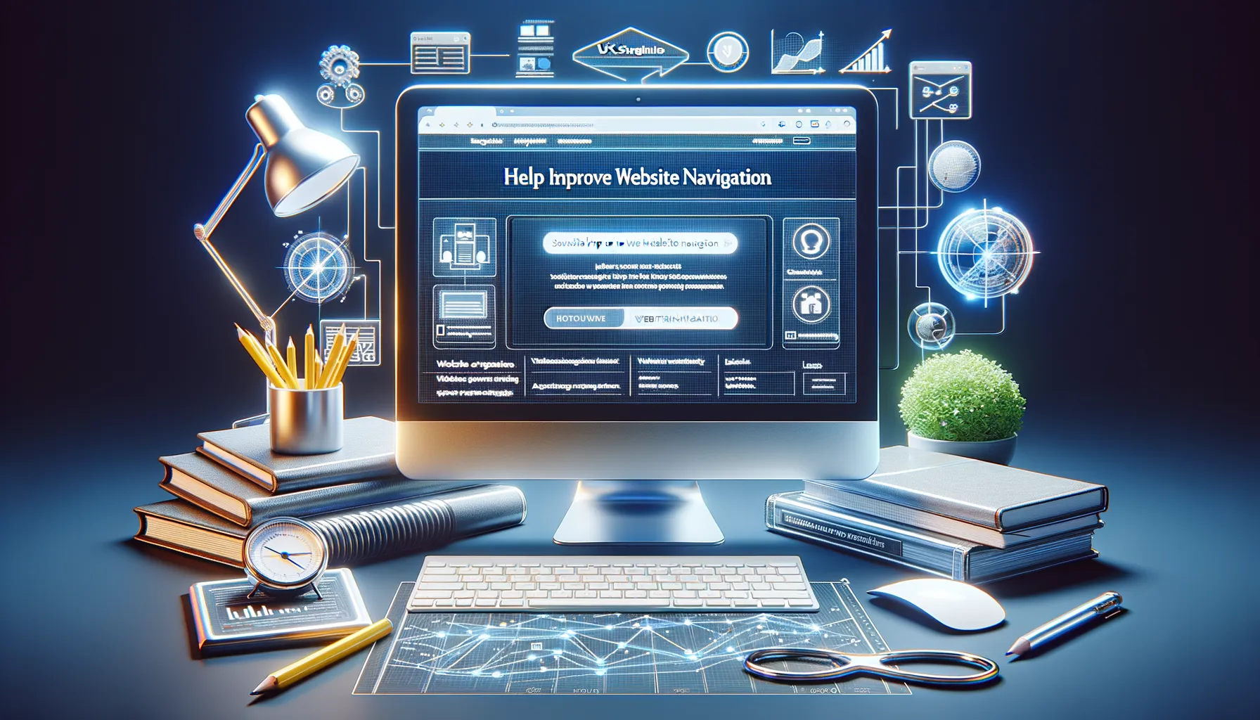
Streamline Navigation with Smart Tools
Let’s face it—tackling website navigation can feel like trying to find your way out of a maze with no map. That’s where the magic of tools and resources comes in! They’re not just helpful; they’re your secret weapon for creating a seamless user journey.
Need insights into how users interact with your site? Turn to Google Analytics. This powerhouse tool reveals which pages visitors flock to, where they hit roadblocks, and what paths they abandon. Pair it with Hotjar to actually *see* clicks, taps, and scrolls through dynamic heatmaps. It’s like having a front-row seat to your customers’ thought process.
Resources to Power Up Your Design Game
For design tweaks that scream “intuitive,” check out platforms like Figma or Adobe XD. Want navigation tailored to mobile devices? Responsive frameworks like Bootstrap are a lifesaver. And don’t forget the wonders of SEO tools like Yoast—they nudge your menus toward search engine perfection.
Here’s a quick toolkit to get you started:
- Screaming Frog: Spot broken links and navigation issues.
- Card Sorting by Optimal Workshop: Nail down a menu structure your users will love.
Dive in and let these tools work their magic—you’ll be navigating the path to perfection in no time!